Insights
How to Test Your Website’s Readability in 60 Seconds
You can preview your site through different eyes for free with three clicks. All you need is a browser and a minute.
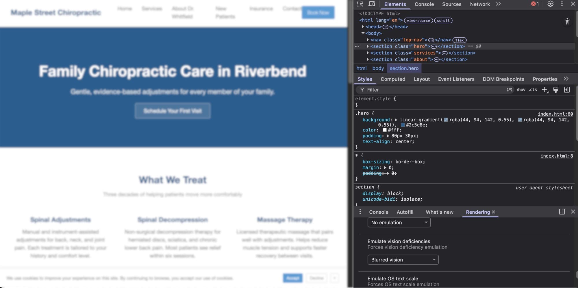
Step 1: Open Inspect
Right-click anywhere on your page and choose Inspect. A panel opens on the side or bottom of your screen. This is the same developer tools panel professional engineers use. You do not need to understand most of it. We are going to use two small features, and nothing you do here changes your live site or installs anything on your computer.
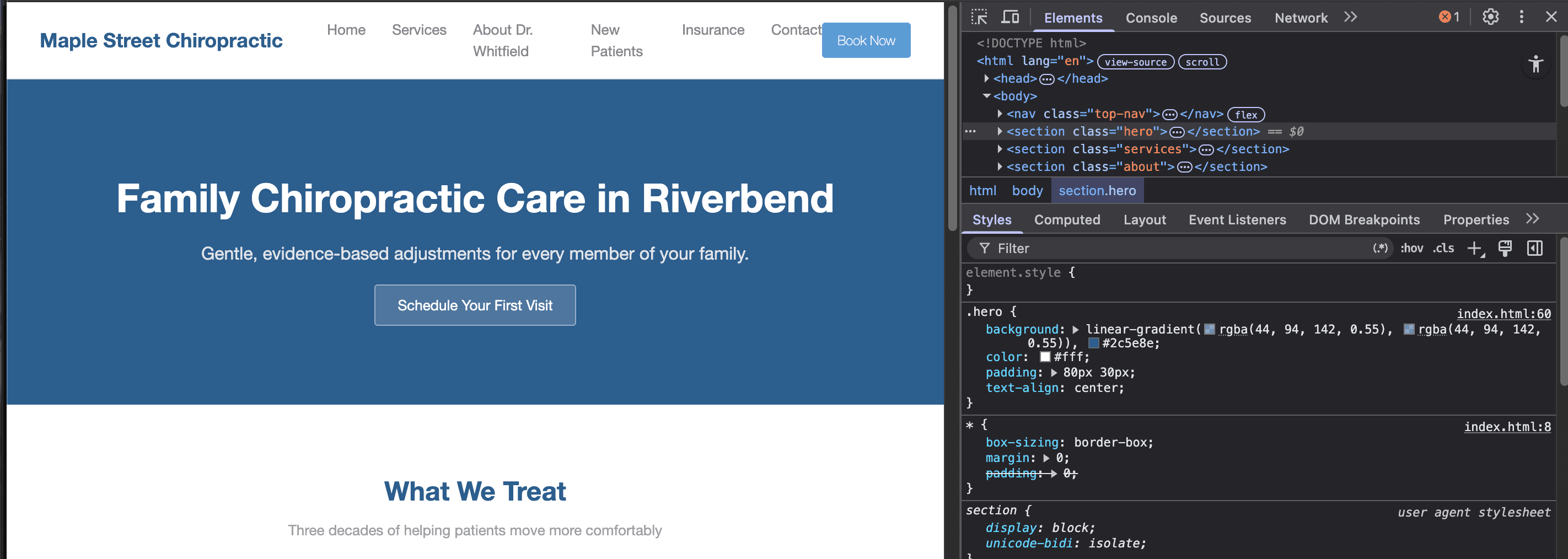
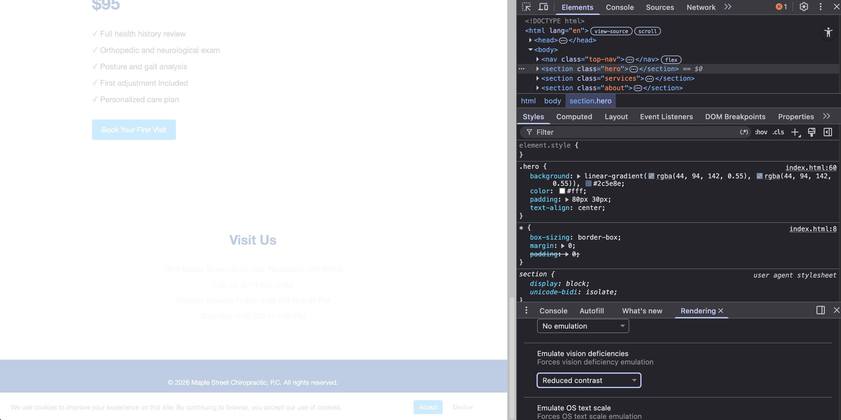
Step 2: Emulate Vision
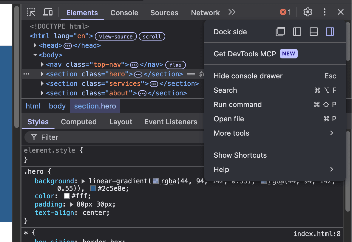
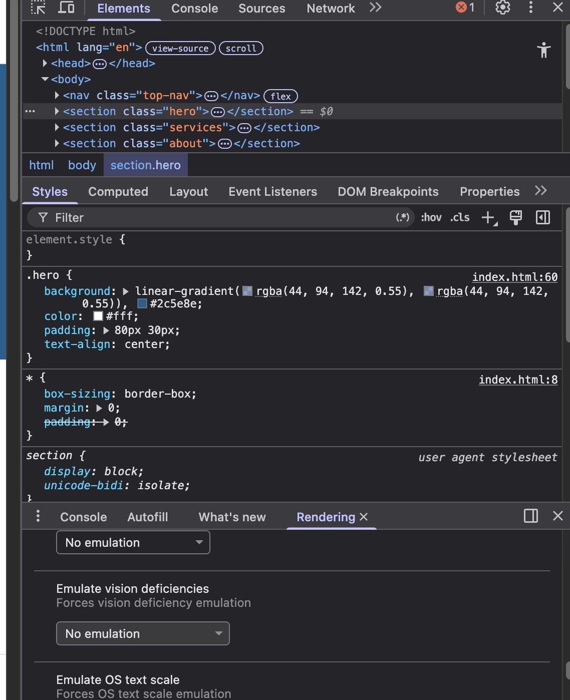
Look for the three dots at the top right of the panel. Click those and hover over More tools, then select Rendering. You will notice a new tab open at the bottom of the panel.
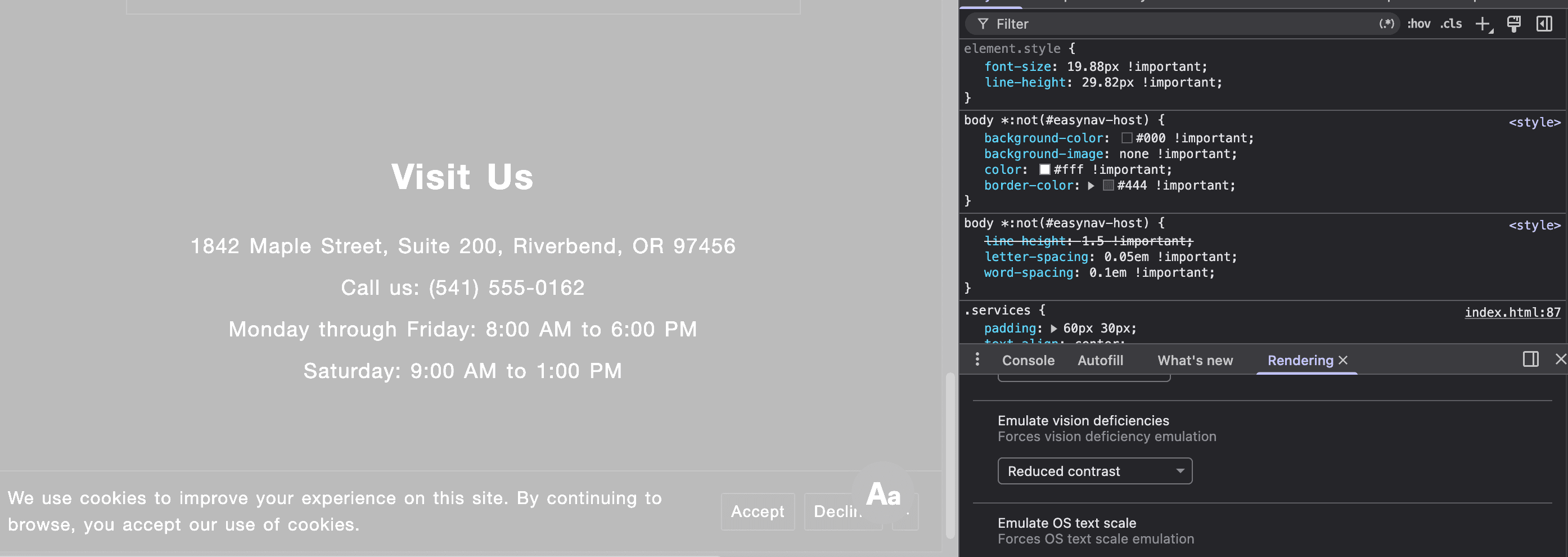
Scroll inside that tab until you see the option to Emulate vision deficiencies. Try Blurred vision, then try Reduced contrast.
Now try to navigate your page. Can you still read it? This is roughly what your site looks like to a visitor in their late sixties without their reading glasses, or to anyone with mild eye fatigue at the end of a long day.
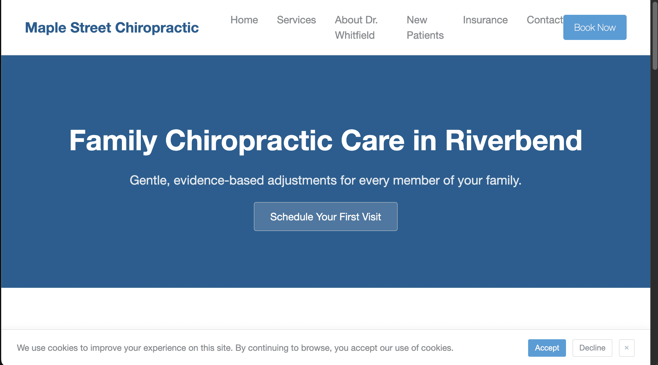
Step 3: Test for Scale
This one is even simpler. No developer tools or menus. Just one keyboard shortcut.
Press Cmd and the plus key (Mac) or Ctrl and plus (Windows). Each press zooms your page up by 10 percent. Hit it two or three times until you reach about 150 percent. Then resize your browser window narrower. Scroll and try to click your buttons. Look at where your pricing block or contact info ends up.
To reset, press Cmd 0 or Ctrl 0.
Zoom does not break most modern sites. Well-built pages scale up calmly, and most visitors will not notice a thing. The pages that do reveal something are showing you the short list worth fixing. A button overlapping text, a menu colliding with itself, a pricing card pushing the Book Now button off-screen.
Most of your older visitors will not press Cmd plus. Keyboard shortcuts are not how older visitors browse the internet. Some pinch their screen or lean forward and squint. Most leave. Almost none are telling you about it. That is why this test is yours to run on their behalf. If your page still feels calm at 150 percent, you have already done more than most sites bother to. If it does not, you have your fix list.
Common Fixes Worth Knowing
Small Text. Body copy under 16px is too small for comfortable reading. 17px or 18px is usually better.
Low Contrast. Light gray on white is the most common readability sin. If you have to squint on a sunny day, so do your visitors. A free tool like WebAIM’s contrast checker will tell you exactly where your text falls short. For why this matters most on contact details, see Why Half Your Visitors Can’t Read Your Phone Number.
Tiny Buttons. Tap targets under 44 pixels are hard for anyone with hand tremors or arthritis. That is a larger group than you would guess.
Small Print. “Close” and “Skip” links smaller than your body copy can feel like an afterthought. Sizing them the same as your main text signals that every action matters, not just the ones you wanted the visitor to take.
For more on the philosophy behind these adjustments, see The Waiting Room Effect. For the full checklist of common accessibility issues and what to do about each, see The Website Accessibility Checklist. On how EasyNav compares to other tools in the category, see The Foundation and the Overlay.